A New Logo and Custom Web Design for Talos InfoSec
Another website created by FirmDesign has gone live! The cyber security consulting firm, Talos InfoSec, has launched their site and is ready for ...
What is responsive web design?
---> Responsiveness in the world of web design refers to a site’s ability to adjust for the best viewing experience according to the device being used.
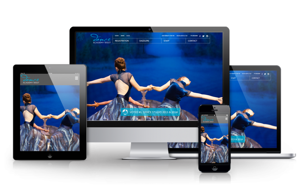
We live in a web-driven world, and most of our online activity doesn’t occur sitting at a desk in front of a computer monitor anymore. Rather, our online experiences are mobile and on-the-go. It makes sense that websites ought to be optimized for mobile devices, adapting to the varying dimensions of screens of cell phones which are much smaller than desktop computer screens. Google decided to drive the push towards this optimization by implementing what has been dubbed the mobilegeddon, an algorithm change which will affect SERP rankings based on the mobile-friendliness of a website.
In one of their blog posts, Google asserts their commitment to accessibility. This commitment to provide the best browsing experience led them to choose between creating websites that were specifically for mobile devices, or adapting existing sites to be able to perform well on both desktop computers and mobile devices. Out of simplicity and preservation of canonical URLs, the latter choice became the better option. Hence, responsive web design was developed in order to satisfy the following guidelines:
Meta viewport tags serve as a signal to browsers that the web page will adapt to all devices. This tag is what provides the instructions of how to adjust dimensions and scaling accordingly to the device screen. If there is no meta viewport tag, the mobile browser defaults to a desktop screen view - leading to increased font sizes and scaling of content. The inconsistent appearance requires an increased level of interaction on the user end, causing them to tap, pinch to zoom, and scroll around the page to be able to view content. This is the type of unfriendly interaction Google sought to avoid. Now in the web-driven world of quick and easy access to information, human frustration with navigability and viewing experience of a site on our phone screens can punish a business’s SERP rank.
Responsive web design makes sense though. We live in a natural world of adaptation (just think Biology 101), why shouldn’t our technology continue to adapt? So many aspects of our technological experience do evolve and respond to human use and desires, and responsive web design is just another instance of survival of the fittest. In order to remain competitive in this day and age, a website must be able to adapt to provide the best user experience on cell phones and tablets in addition to desktop computers. Use this neat tool from Google to determine if a website is mobile-friendly, and if your results are less than favorable, reach out to us at FirmDesign!